The Shooting Star Candle Pattern

This pattern is related to the gravestone doji formation, but is opposite to the hammer. The shooting star is a bearish reversal pattern, that comes after an uptrend. This is a one candle pattern. Ideally, the security you are looking at will be overbought.

The first rule for this formation is that on the day of the formation, the candle opens higher than the previous day's close. From there, the bulls must push prices substantially higher intraday. Then, at some point during the trading day, the bears must come out, and push prices much lower, closer to the opening of the day. Ideally, there is no lower shadow, but a very long upper shadow, and a small real body. The colour of the real body does not matter.

This marks a change of control from bulls to bears, and is a fairly reliable signal. For greater accuracy, I would suggest waiting for downside confirmation on the following day.


Notice how in the above chart, which is of the ten year yield, the price was overbought, and it was at a former high level, which indicates possible resistance, and a double top. This combined with the shooting star that formed provided three separate pieces of evidence that a reversal was likely. Bond yields play an indirect role in the price of gold.

Bullish Engulfing Candlestick Pattern

In my previous post, I said to the person who commented that I would show a copper chart soon. At the same time, I also wanted to show an example of the bullish engulfing pattern, which I had not covered yet. Luckily, I will be able to kill two birds with one stone in this post.

Below is a chart showing the daily price action of Red Gold. The bullish engulfing pattern is circled in blue. Please click on the chart to get a larger view.


This is a pattern involves 2 candles, and here are the rules for a bullish engulfing candle. First, the price must be in a downtrend, as this is a bullish reversal pattern.

Secondly the first candle of the pattern must be red, and must be long, which indicates that the bears are in control. Ideally, this red candle will close near the lows for the day.

Third, the second candle in the formation must open below the previous day's low, and close above the previous day's high. Ideally, the second candle will close near the highs for the day, indicating total victory for the bulls. In this way, the second candle completely envelops the first candle. This marks a change of control from bears to bulls.


The above image shows a magnified view of what happened. This bullish engulfing pattern was not perfect, as the second candle only wrapped around the real body of the first, and not the wicks as well.

The red line, in the image above, represents the 200dma, and notice how the price descended down to this line, but stopped cold at this point. This was not a coincidence, as there were many traders waiting with buy orders at this level. I have seen this happen time and time again. It makes me wonder how some people still think that market prices are completely random.

Tall Open Candle Stock Scan

Once you gain a basic understanding of candles, and the pyschology behind them, it becomes clear that some individual candle lines are extremely bullish. The problem is that if you are just looking at your favourite stock, special candle formations may come about only once in a blue moon.

This problem can be aleviated through using stock scans. The website, www.stockcharts.com, which is where all my charts originate from, also has a very powerful stock scanner. In this post, I will show you how we can scan through thousands of stocks and pick out a couple that meet our criteria.

This post will involve a scan that is very simple, but also highly potent. I have taken a screen shot of StockCharts stock scanning setup:


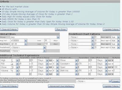
What we are trying to do is find a stock in North America that, for the day, experienced a large increase, with heavy volume, and closed on the high of the day. This candle would be tall, white, and have shaved head. In my opinion, this is an extremely bullish combination.

So, if you look at the above image, at what I have marked off as line 1, what this says is that the high zero days ago (today) is equal to the close today. This is the shaved head part of the equation.

Line 2, just says that we do not want stocks that are overbought. We want stocks that have a 9 period RSI of less than 70.

Line 3 says that we want the close to be greater than the open for today. All this means is that the stock needs to have risen today. And it needs to this by a factor of 1.02, which means that the stock must have risen by 2% or more on this day.

Finally, line 4 says that we want the stock's volume for today to be twice as much as the 50 day moving average of volume. Basically, we want heavy volume for this day.

When I ran this scan a couple weeks ago, it picked out the following stock, and I'll show a chart of it now.


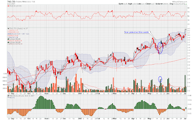
I have drawn a circle around the candle the scan isolated. As you can see, it was indeed tall, it closed at the high of the day, and the volume was heavy. This meant that the bulls were clearly in control on this day and that higher prices would likely follow. Another aspect of the chart that I like, and the scan had nothing to do with this, is that the stock is in an uptrend. That is worth a lot of points in my books.

Although this scan does not really have anything to do with gold stocks, I think it is important hold some stocks that are not gold related. This scan has helped me add stocks to my brokerage account that are not correlated to my gold stocks holdings, so it helps reduce some risk. Anyway this post was quite long and went through a lot of information, and I hope it made sense. If not, send me an email.